
Tuesday, April 28, 2015
The Portuguese Version of "Sleep"
Maria João Lourenço, the Portuguese translator of Murakami, read the previous post and made me realize that I had failed to mention the Portuguese edition of Sleep, which came out in 2013 in her translation (sorry and thank you, Maria João!). The Portuguese edition also includes Kat Menschik's illustrations. Here is a picture of the cover.
Sunday, April 19, 2015
More on Translating Images and The Strange Library
When talking about translations of Murakami and illustrations, one has to mention the German illustrator Kat Menschik (in the picture below), who worked on The Strange Library, among other Murakami writings. The drawing on the right shows Murakami and Menschik together (although she doesn't look like herself...).


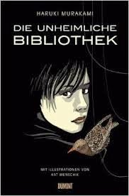
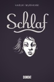
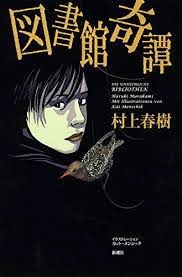
In the previous post, I wrote about the illustrations in the British and American version of The Strange Library. The story came out in German a year earlier, in 2013, in Ursula Gräfe's translation, Die Unheimliche Bibliothek, illustrated by Menschik. Menschik had earlier done the illustrations for three other Murakami stories: Schlaf ("Sleep," 2010, translated by Nora Bierich) and Die Bäckereiüberfälle (which consists of two short stories, "The Bakery Attack," and "The Second Bakery Attack," 2012, translated by Damian Larens). While the first of these (The Strange Library/ Fushigi na Toshokan) was also an illustrated book in Japanese, the other three stories were not, and appeared in short story anthologies.


All three stories were re-published in Japan with Menschik's illustrations. What is interesting is that the title of the Strange Library went back to the original 1982 title, Toshokan kitan (Strange Tales of a Library), and the title of Bakery Attacks ("Pan'ya Shūgeki" and "Pan'ya saishūgeki") became something like "To Attack a Bakery (or Bakeries)" ("Pan'ya o osou"). It may be the case, of course, that the Japanese version IS in fact a new edition of the original story, which was much longer. (I will order it and report.) Below are the only two illustrations included with "Toshokan kitan" in the 1983 anthology, titled Kangarū-biyori:


Below are the covers of the Japanese editions of Toshokan kitan (2014, Strange Tales of a Library), Pan'ya o osou (2013, To Attack a Bakery) and Nemuri (2010, Sleep), all with Menschik's illustrations:


Menschik's illustrations clearly are admired by many, since the Spanish edition of the Strange Library (or rather: Secret Library) (2014, Lourdes Porta, tr.) and the French edition of Bakery Attacks (2012, Corinne Atlan, Hélène Morita, tr.) also used her images:


In the previous post, I wrote about the illustrations in the British and American version of The Strange Library. The story came out in German a year earlier, in 2013, in Ursula Gräfe's translation, Die Unheimliche Bibliothek, illustrated by Menschik. Menschik had earlier done the illustrations for three other Murakami stories: Schlaf ("Sleep," 2010, translated by Nora Bierich) and Die Bäckereiüberfälle (which consists of two short stories, "The Bakery Attack," and "The Second Bakery Attack," 2012, translated by Damian Larens). While the first of these (The Strange Library/ Fushigi na Toshokan) was also an illustrated book in Japanese, the other three stories were not, and appeared in short story anthologies.

It would be worth thinking about the relationship between illustrations and the translated text: What new qualities do they add to the story? Do they detract from the story or help us enjoy it more? Do they make concrete something the author intended to leave vague? In the case of stories that were originally accompanied by illustrations, why not use those? Do illustrations have to be "translated," too? In the case of stories that originally lacked illustrations, what does it mean to add that element?
Menschik's illustrations, as is already clear from the cover of the Die Unheimliche Biblioteque, are quite different in style from the original ones by Maki Sasaki. Below left is a picture showing both editions of The Strange Library. On the right is an illustration of the German version of Sleep, which was not illustrated in the original.


All three stories were re-published in Japan with Menschik's illustrations. What is interesting is that the title of the Strange Library went back to the original 1982 title, Toshokan kitan (Strange Tales of a Library), and the title of Bakery Attacks ("Pan'ya Shūgeki" and "Pan'ya saishūgeki") became something like "To Attack a Bakery (or Bakeries)" ("Pan'ya o osou"). It may be the case, of course, that the Japanese version IS in fact a new edition of the original story, which was much longer. (I will order it and report.) Below are the only two illustrations included with "Toshokan kitan" in the 1983 anthology, titled Kangarū-biyori:
Below are the covers of the Japanese editions of Toshokan kitan (2014, Strange Tales of a Library), Pan'ya o osou (2013, To Attack a Bakery) and Nemuri (2010, Sleep), all with Menschik's illustrations:
Menschik's illustrations clearly are admired by many, since the Spanish edition of the Strange Library (or rather: Secret Library) (2014, Lourdes Porta, tr.) and the French edition of Bakery Attacks (2012, Corinne Atlan, Hélène Morita, tr.) also used her images:
The same is true of the story Sleep, which came out with Menschik's images in French (2010, Corinne Atlan, tr.), Spanish (2013, Lourdes Porta, tr.), and Italian (2014, Antonietta Pastore, tr.) It is worth noting that in both Spanish translations Lourdes Porta got her name on the cover!


Translating Images

I have been thinking lately about the role illustrations play in a translation. Last December I read an article by Roland Kelts titled "Illustrating Murakami." It talks about Chip Kidds illustrations for the American version of The Strange Library.
When talking about translations, we tend to focus on the text. Sometimes a cover gets mentioned in a review, but that's about it -- usually we don't discuss illustrations, since most books for adults are not illustrated. In the case of Murakami's The Strange Library, however, published in Ted Goosen's English translation last December, the illustrations deserve special attention.
This book was originally a longish short story titled Toshokan kitan (Strange Tales of a Library) published in six parts in 1982. The story was later somewhat rewritten and came out in 2005 as an ehon (an illustrated book) titled Fushigi na toshokan (The Strange Library). (You can read more about this story's history in the post from September 6, 2014.)
The illustrator for the 2005 book was Maki Sasaki. The British edition (Harvill Secker, 2014) was designed and illustrated by Suzanne Dean, and the American edition (Knopf, 2014) was designed by Chip Kidd. All three are pictured below.


One look at the three covers makes it clear that we are dealing with three very different books. The Sheepman (Hitsuji otoko) featured amongst flying donuts on the Japanese cover gives a fun, whimsical impression. The British cover -- complete with an actual sleeve for holding old-fashioned library cards, covered with stamps, the last one saying 2 DEC 2014, the date of publication -- is simple and unusual, but doesn't give anything away. The American cover actually unfolds (it is held together by a seal-like sticker bearing the number 107) to show the first sentences from the book, written in large font that looks like an old typeface. In other words, we start reading the book (enter the library?) before we have even had a chance to turn a single page.


That feeling of dealing with different books only deepens as we turn the pages. Generally speaking, the British edition is full of beautiful old pictures, apparently found by the designer in the London Library (see the post from September 25th), including old drawings of insects, dogs, tea cups, etc.
The Chip Kidd version is more abstract. Some pictures appear to be close-ups, many with definitely Japanese elements, which are completely absent from the original pictures by Sasaki. Two examples featured below show how the story, describing a travel into the protagonist's Jungian-style psyche, has been orientalized in its American version:


I see no good reason to include this type of image, perhaps except for the illustrator's or publisher's belief that you have to have something Japanese in a Japanese book.
Let's look at two further examples of differences in the three illustrators' visions of the book's imagery.
1. There are a few mentions of bugs in the book. The first has to do with small black bugs "scratching about on the underside of the lampshade" in the old man's room. The second comes in a comment made by the Sheepman (or sheep man, as Ted Goossen calls him) who, answering the question whether he can help the protagonist get out of the library, responds: "If I did that, I would be chucked into a jar full of hairy caterpillars. A big jar, with about ten thousand of the buggers crawling around, for three whole days." Let's look at the three sets of bug-related illustrations below:
In the Japanese version, we see flies buzzing around the lamp and the Sheepman in a jar, but the caterpillars are not pictured:


In the British version, we have beautiful prints of insects and caterpillars, which seem more like variations on the theme of bugs than illustrations of the story:


The same is true of the American version:


2. The protagonist is reading A Diary of an Ottoman Tax Collector. Below are the Japanese, British and American illustrations:


The first two are more or less "literal" renditions of scenes from the Ottoman period (the first one done by Sasaki for the original story, the second either an authentic old drawing or else an image created by Dean for this book -- it is impossible to find any information on the source of this image in the book). The third version, by Chip Kidd, portrays a plate or some other decorative element, simply suggesting Turkey.
My impression is that the pictures in the original are meant to be enjoyed by adults and children, but the British and American ones are addressed to adults, albeit playful adults (more playful in the American case). It makes one think about the very important role illustrations play in the impression the translated book creates. No doubt it has a lot to do with publishers' marketing strategies and the way they envision the profile of a potential reader in each country.
But seeing these very different three versions, one wonders, would The Little Prince have been a different book in English, German, French or Polish translation if it hadn't included Saint-Exupéry's watercolors?
To read about Maki Sasaki (in Japanese), go to:
http://www.art-life.ne.jp/creator/artist_top.php?artist_id=C0091
To read more about Suzanne Dean's designs, go to: http://www.telegraph.co.uk/culture/books/8929045/Suzanne-Dean-the-secret-to-a-good-book-cover.html
To hear and see more about Chip Kidd, go to:
https://www.youtube.com/watch?v=cC0KxNeLp1E
https://www.youtube.com/watch?v=HGunvu4T5kU
Subscribe to:
Posts (Atom)